A long time ago I graduated from not a top university (The London School of Economics and Political Science) with what was considered a flaky degree (BSc. Social Psychology). Landing a proper job at a time of miners’ strikes when Mrs Thatcher was trying to break the unions’ backs was difficult but, surprisingly, I landed a job at a small UK clearing bank’s City of London office. My two very clever bosses said I was to be their chief chartist because US futures traders all used them. Thus, I am now a behavioural technical analyst with over 30 years’ experience under my belt.
Fifteen years on I landed another very lucky break and joined Japan’s most prestigious corporate bank. This is where I eventually learnt how to chart with candles and clouds, a technique invented by a Japanese stockbroker in the early 1960s. This led to lectures and the speaking circuit, then a publisher offered a book deal and the first edition of Ichimoku Charts came out in 2007. It was the first-time Westerners had the opportunity to learn about this method as previous texts only existed in Japanese.
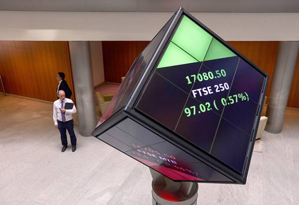
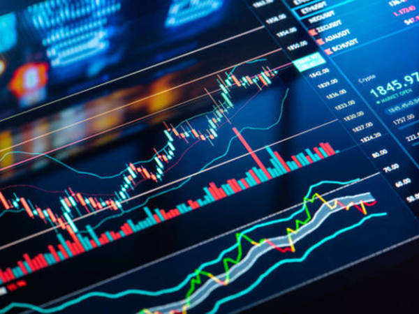
The system is loosely based on moving averages, something most investors have used for years, and it tries to capture intermediate trends. Stock brokers tend to favour the 50- and 200-day moving average crossover method, active traders and bank dealers usually opting for shorter time periods. Ichimoku uses the mid-point (not closing price) of the last nine and 26 trading days, back-tested manually (this was before the advent of the PC) by a small army of underlings who were sworn to secrecy. If the shorter average is above the long one, then one buys and stays long the instrument; vice-versa when they switch, meaning one is continually in the market. This has what can be a very expensive drawback.
The clever bit is that a further manipulation is done to the averages, and these two are plotted 26 days ahead of the latest day’s data. The difference between the two lines is shaded, irrespective of which one is on top, and is called the ‘cloud’. It gives two secondary levels of support or resistance, and are used in conjunction with the crossover of the averages to confirm or question the trend.
Another time-shift is used, plotting the closing price of the daily chart 26 days behind today’s price; this is called, sensibly enough, the ‘lagging line’. Used in conjunction with the older candles, it gives further levels of support or resistance and can be used to confirm current chart patterns and key areas.
A lesser-known part of Ichimoku analysis are the Three Principles: Wave, Price Target, and Timespan; these are considered integral to the correct use of the method. Price targets are used in conventional technical analysis, for example the head-and-shoulders pattern’s height from the neckline is the measured target. The wave idea has a few, fleeting similarities with Elliott Wave theory, where bullish and bearish intermediate trends are mapped and monitored. The timespan can be likened to cycle theory, counting days and weeks ahead to gauge when a trend might turn.
Although a niche form of analysis, market professionals have embraced it wholeheartedly and I know why. Because it improves on the more usual bar charts, and because it works!