How much worse might it get? Depends what’s meant by ‘it’; currently there are so many choices. Let’s take it to mean inflation. That’s the likely choice both because supply-side inflation was a major cause for concern before the Ukrainian crisis began and, when all is said and done, the war’s major impact on UK consumers – as with all war – will be higher prices across the board.
So here’s a novel way to assess inflation’s impact, which might help tell us whether the current rate really is a cause for alarm or whether it’s more about central bankers getting in a dither.
True, the UK’s current inflation rate of 4.9 per cent, according to the Bank of England’s favoured measure (the so-called CPIH), is the highest in a generation (since 1990). But on a longer view, the numbers look less worrying. Switch the data to the much-maligned Retail Price Index – because there is a much longer run of figures – and inflation was 7.8 per cent in January. That’s bad because it’s 50 per cent above the RPI’s average since 1948, but less bad because it is well within plus one standard deviation of the average.
Anyway, the idea is to compare inflation rates with their long-term average. Specifically, the chart and table are based on each month’s average of the latest three months compared with its 36-month average. Since the 36-month average will be a distinctly smoothed figure, it should be easy to see how exceptional (or not) is the latest data. In addition, the juxtaposition of the present with its three-year average is measured in two ways – first, by finding the inflation gap, the difference between the volatile short-term rate and the smoothed longer-term rate; second, by finding the ratio between the two (ie, dividing the short-term rate by the long-term one).
These two approaches aim to tease out the significance of changes in inflation rates. Should investors pay more attention to the inflation rate itself or to how it stacks up in relation to its medium-term past? For example, in the chart the peak figure for the ratio between the three-month and 36-month inflation rate is 2.9 times, which occurred in October 1961, another occasion when the West and Russia, in the guise of the Soviet Union, were confronting each other (this time chiefly in Berlin). That ratio might imply inflation was letting rip. Except it wasn’t. The rate for that month was 3.9 per cent. This was nothing exceptional in the UK’s post-War experience and 1961 was still some years before the demand-side inflation that characterised the UK in the late 1960s and 1970s really got moving. So the inflation gap of 2.4 percentage points between the short-term and long-term inflation rates implied nothing of great significance; it was not far above its average for the 70 years for 1951-2021.

Perhaps the sign to look for is when simultaneously the inflation ratio is high and the inflation gap is wide. As the table shows, that has happened only twice. Once in the autumn of 1951 and now. The 1951 instance was a period of fast-rising inflation driven by post-War supply-side constraints combined with burgeoning public spending as the modern welfare state took shape.
True, share prices had a poor time the following 12 months, falling about 16 per cent. But hindsight tells us this simultaneous hit of high inflation ratio and wide inflation gap portended nothing disastrous. The UK gradually clambered out of its post-War dreariness to the extent that six years later prime minister Harold Macmillan was able to tell Britons they had never had it so good. The USA danced on to its Technicolor brightest and, despite paranoia on both sides of the ideological divide, the West and the Soviet empire avoided mutual destruction. More to the point, the 1950s were extremely kind to investors. On average, London share prices rose by 12 per cent a year after stripping out inflation’s effects; an average that was exceeded only in the 1970s and 1980s during the century.
Elsewhere, the table offers mixed signals. Some of the inflationary peaks can plausibly be associated with major events. The obvious ones are: October 1961 and East-West tensions following the construction of the Berlin Wall; June 1975 and the UK’s runaway inflation that year, which peaked at almost 27 per cent in August; in May 1980, the effects of the Iranian oil crisis, which had begun the previous year; the eurozone crisis of 2010. How share prices will have moved before or after these events seems random, with the caveat that they are more likely to have risen than fallen. In 11 of the 18 12-month periods under review in the table, share prices rose. Yet this might simply tell us that share prices rise more than they fall. Focus only on the eight 12-month periods after a peak and it is an even’s call whether share prices rise or fall.
| Moments of peak inflation | ||||
| Ratio or gap | Cause | Previous 12 months* | Following 12 months* | |
| Peak 36-month ratio | ||||
| Oct-51 | 2.6 | General election | 12.7 | -15.9 |
| May-56 | 2.1 | Post colonialism | -7.3 | 11.3 |
| Oct-61 | 2.8 | Berlin Wall | -8.8 | -3.4 |
| Jun-10 | 2.0 | Eurozone crisis | 17.1 | 21.7 |
| Oct-17 | 2.0 | Brexit | 9.3 | -5.2 |
| Dec-21 | 2.5 | Post-Covid supply | 14.6 | na |
| Peak inflation gap (percentage points) | ||||
| Sep-51 | 7.8 | General election | 13.7 | -16.0 |
| Jun-75 | 12.8 | Peak 1970s inflation | 28.7 | 8.6 |
| May-80 | 8.9 | Iran oil crisis | -7.5 | 29.0 |
| Jan-22 | 5.0 | Post-Covid supply | 15.1 | na |
| *% change in FTSE All-Share index. Source: Investors' Chronicle | ||||
What about this time around? It might be significant that another peak ratio and peak gap coincide – especially since we know the UK’s inflation rate is set to get much higher. The supply-side shortages caused by the Ukrainian war – especially in higher food prices – have yet to make themselves felt.
The peak inflation gap was 12.8 percentage points hit in mid-1975 as the UK’s inflation rate topped 26 per cent. As it turned out, that was a great moment to buy equities for the long term. Don’t expect the inflation gap to stretch to that width this time around. Nor should investors expect equities to perform as they did from 1975 onwards. If anything, the reverse would be the case. On one reading, equity markets the developed world over look dangerously high. That’s the message coming from the cyclically-adjusted price-to-earnings ratio for US shares (the so-called CAPE ratio). According to this, only once have equities been higher rated than now. That was at the peak of the dotcom boom at the turn of the millennium; a moment that presaged a three-year bear market.
Hopefully, equity markets are not in for a repeat showing. But if I were running anything other than an equity income fund, I would be very fussy about swapping cash for shares. Sure, there will be good value out there – perhaps in the defence sector still – but with inflation, gloom and fear around in roughly equal measure, I would want an especially-wide margin of safety between price and estimated value.
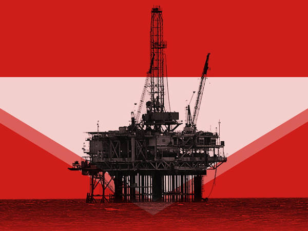
● Call it one of life’s little ironies. You wait forever for a provider of exchange traded funds (ETFs) to offer a quick-and-easy way for retail investors to buy carbon-emissions allowances; then, within a few months of products being launched, along comes something from way out in the left field to flatten their value.
That something, of course, is war; in particular, the war in Ukraine, which is highlighting western Europe’s reliance on oil and gas from Russia. With the dread fear of those supplies being cut off, the West’s response is a mad dash to find alternative sources of carbon fuel closer to home. Whether that means drilling, fracking, liquefying or whatever doesn’t really matter. The imperative is to find alternative power sources and quickly – and damn the need to cut CO2 emissions. Net-zero targets have been conveniently forgotten and, in the process, the value of carbon-emissions allowances has been shot to pieces; after all, what do they matter now?
I caricature. Even so, the price of allowances in the EU’s emissions-trading scheme, by far the world’s biggest carbon market, has faltered badly. From a peak of €93.6 on 11 February the price for the right to emit 1 tonne of CO2 has dropped 25 per cent to €70.6.
Precipitous though that fall is, it needs some context. EU emissions allowances traded at €17.9 just less than two years ago, which indicates that their current price still says a lot about the willingness – enthusiastic or grudging – to bear down on fossil-fuel derived power.
Besides, recall why every private investor should hold carbon emissions – it is less about seeking above-average investment returns and more about having the means to hedge the almost-inevitable costs that will come from swapping reliable, efficient fossil fuels to generate power for less efficient renewables that need almost an entire new energy grid. Yet in the long run, the necessity to make the so-called ‘energy transition’, which will be more like a painful energy slog, won’t change. For what it’s worth, fear about the insecurity of fuel supplies coming from hostile states only enhances the need for renewable power to be generated close to home.
On that logic, the fall in the price of emissions allowances is a buying opportunity. Bearbull’s suggested way in is via SparkChange Physical Carbon (CO2), an ETF whose selling point, as its name implies, is that it is backed by the EU scheme’s allowances rather than by a contract with a counterparty. So the allowances it holds can’t be used to emit CO2. In that sense, it makes a real difference.
bearbull@ft.com